legacy architecture
Overview
Prior client learnings focused the strategy of this research and design towards an architectural overhaul.
Activities performed
Legacy site audit, in-person card sort facilitation, remote tree test, navigational redesign
Team
User Experience Strategist, my role
Journey Owner, Liz Brudowski
Senior UX Researcher, Natalya Pogosova
Senior UX Designer, Rachel Hernandez
My role
As the strategist, I consolidated client learnings, worked with the Journey Owner on roadmapping and prioritization, and defined the activities for which the team would focus. I faciliated the learning sessions, provided guidance, feedback, and structure for the design and research activities.
What client interviews uncovered about the existing structure...
Information overload
“If there’s information available, it’s too difficult to extract in a useful manner!”
Lack of clarity
“The overview very clearly differentiates the accounts between Advisory and Non-advisory. But when I go to the documentation tab there is not enough to know which accounts are which.”
Card sorting activity results
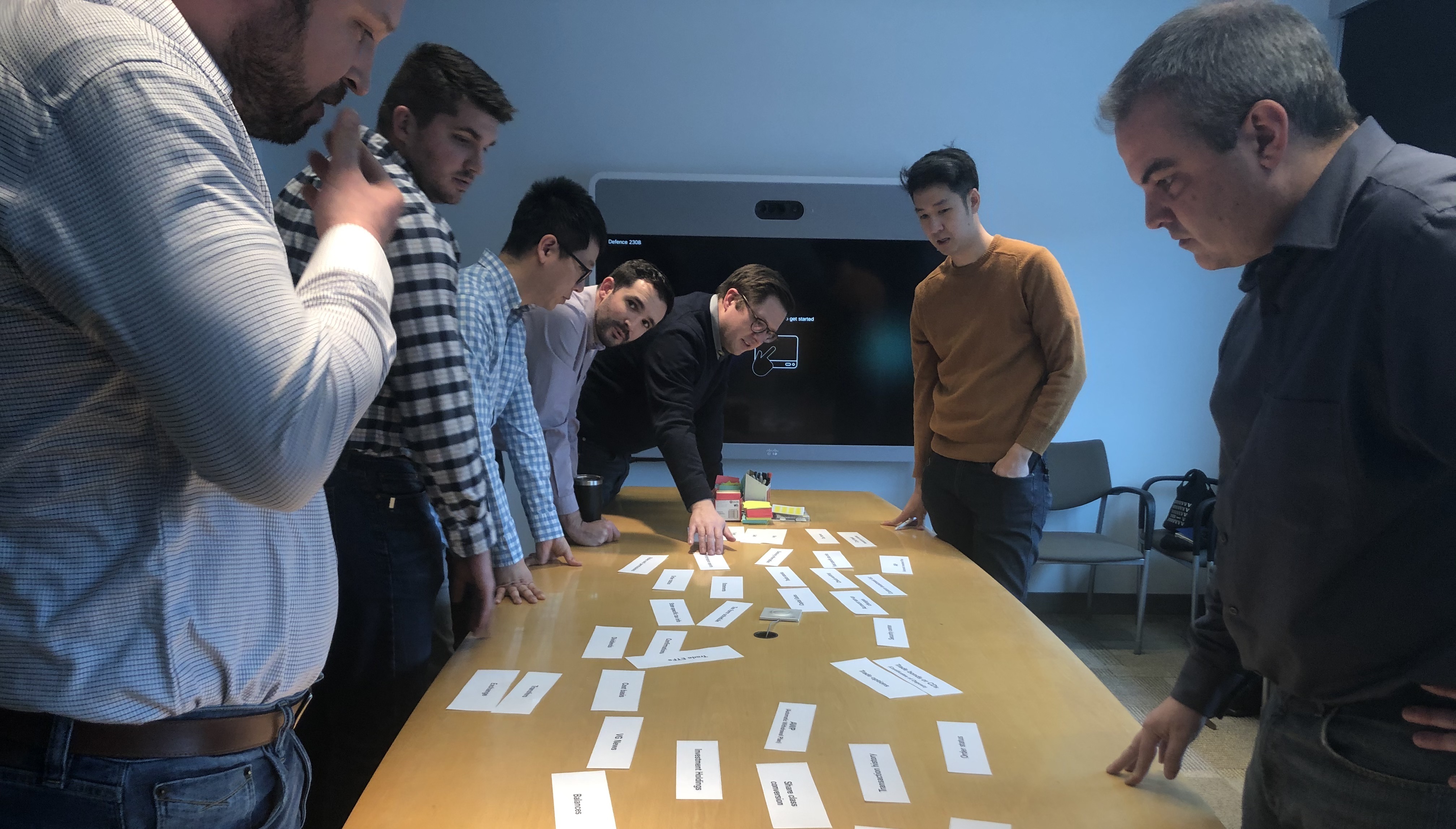
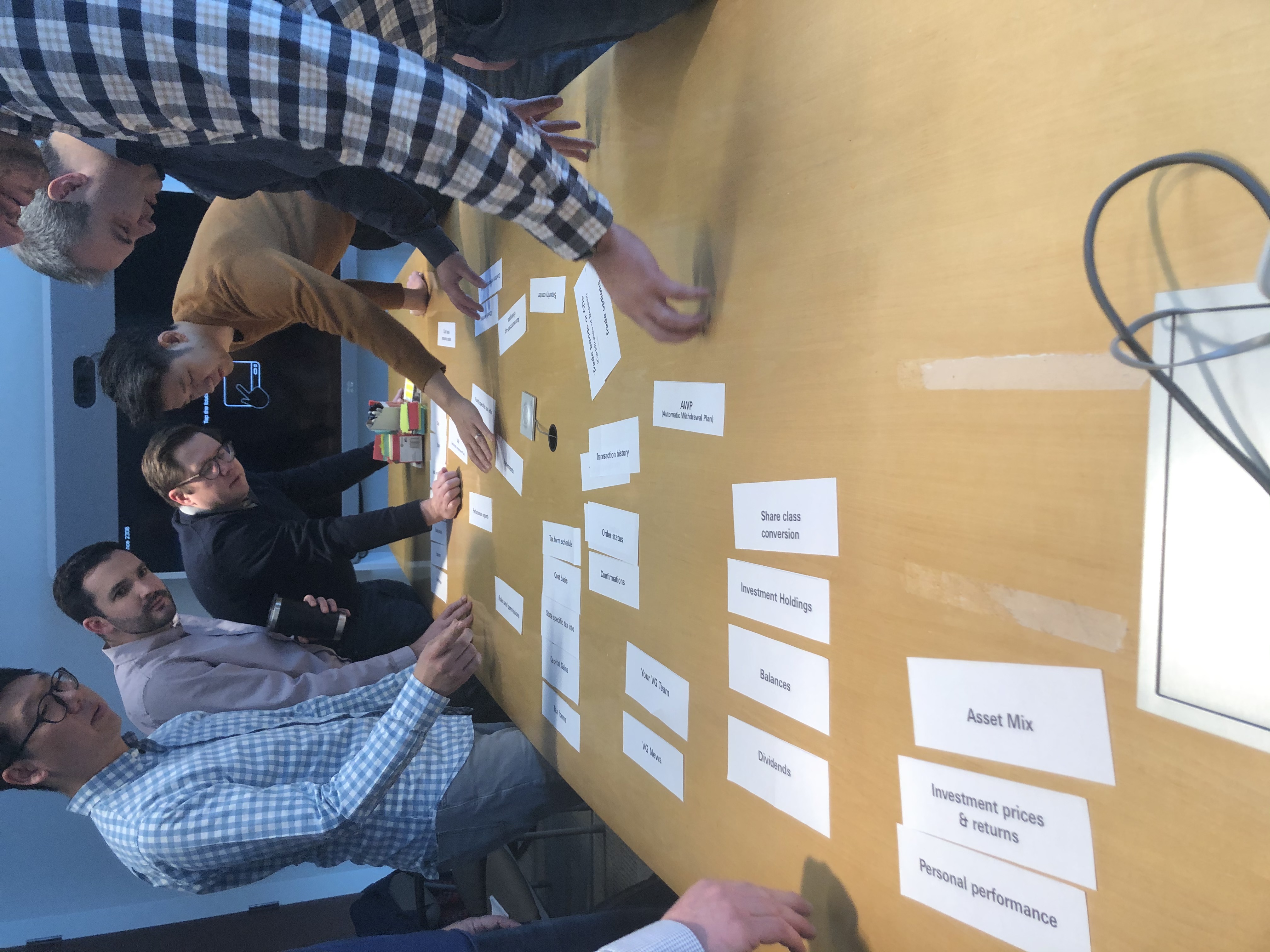
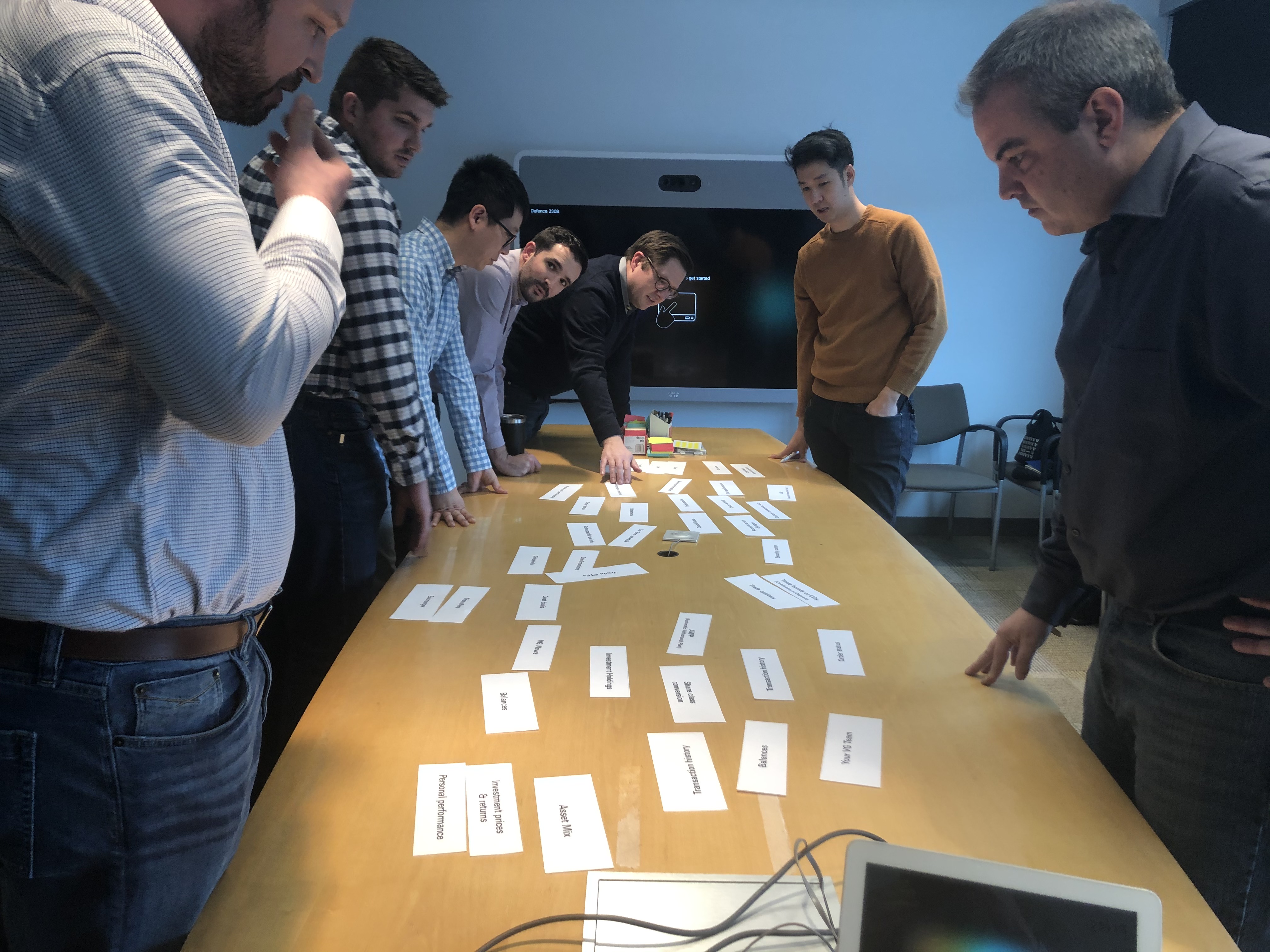
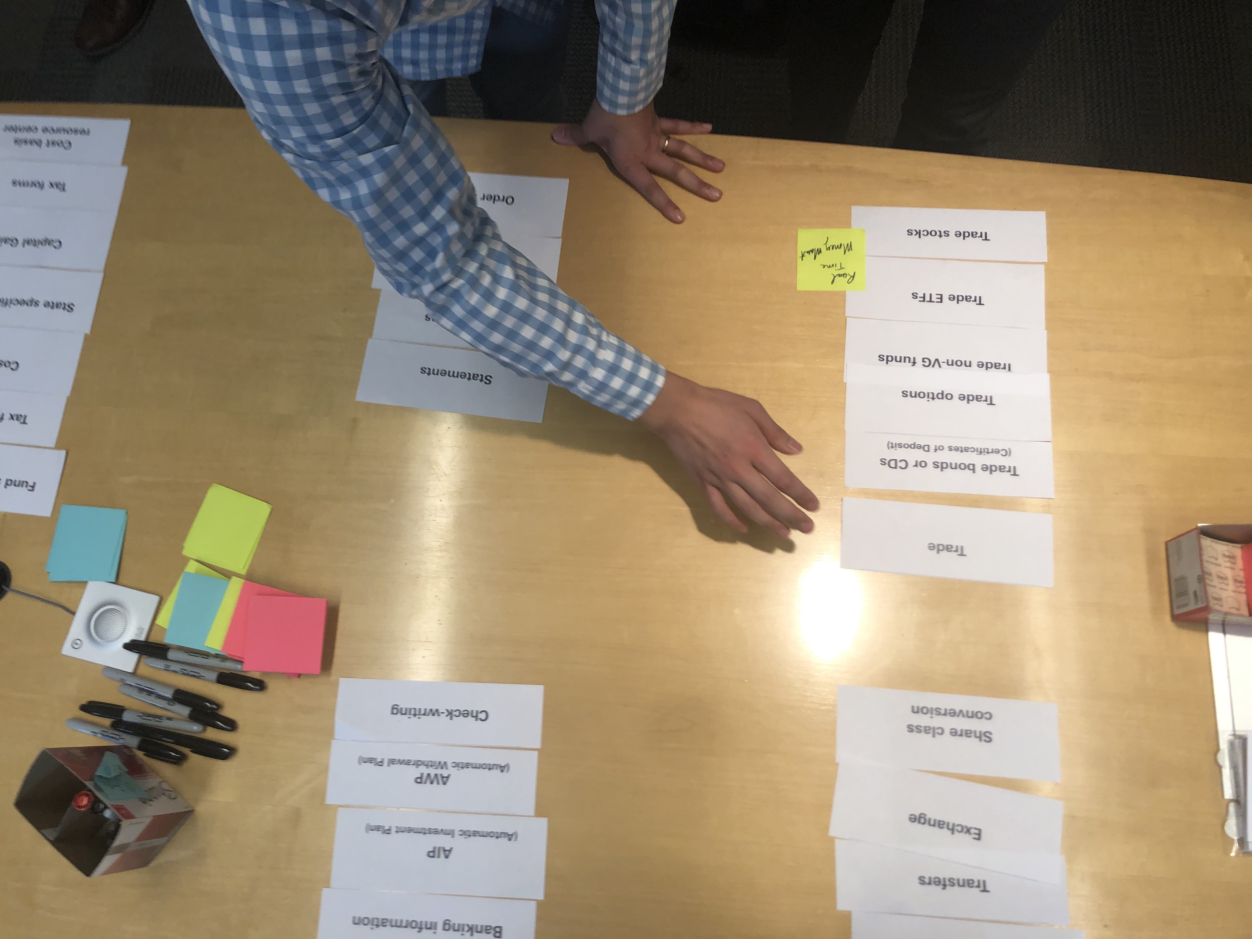
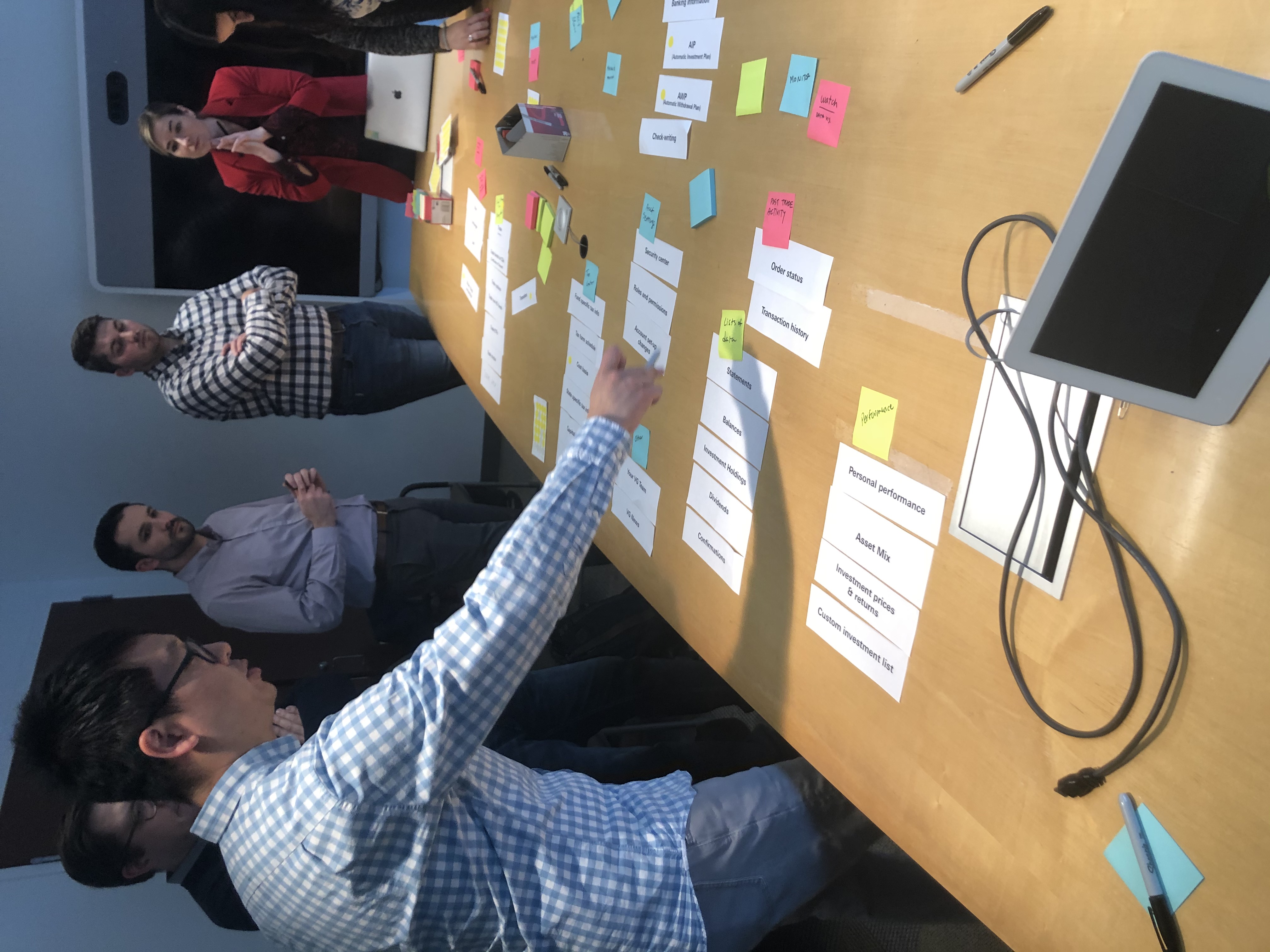
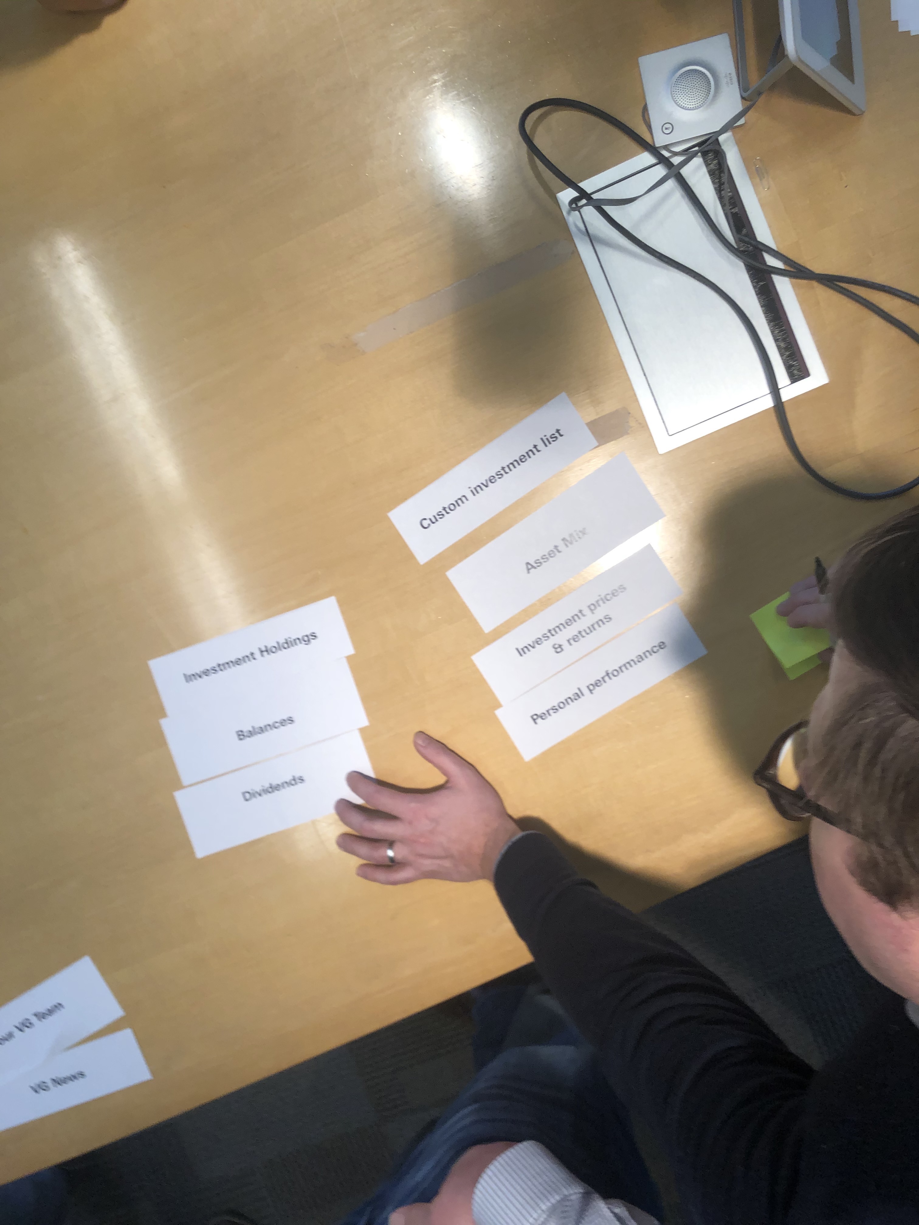
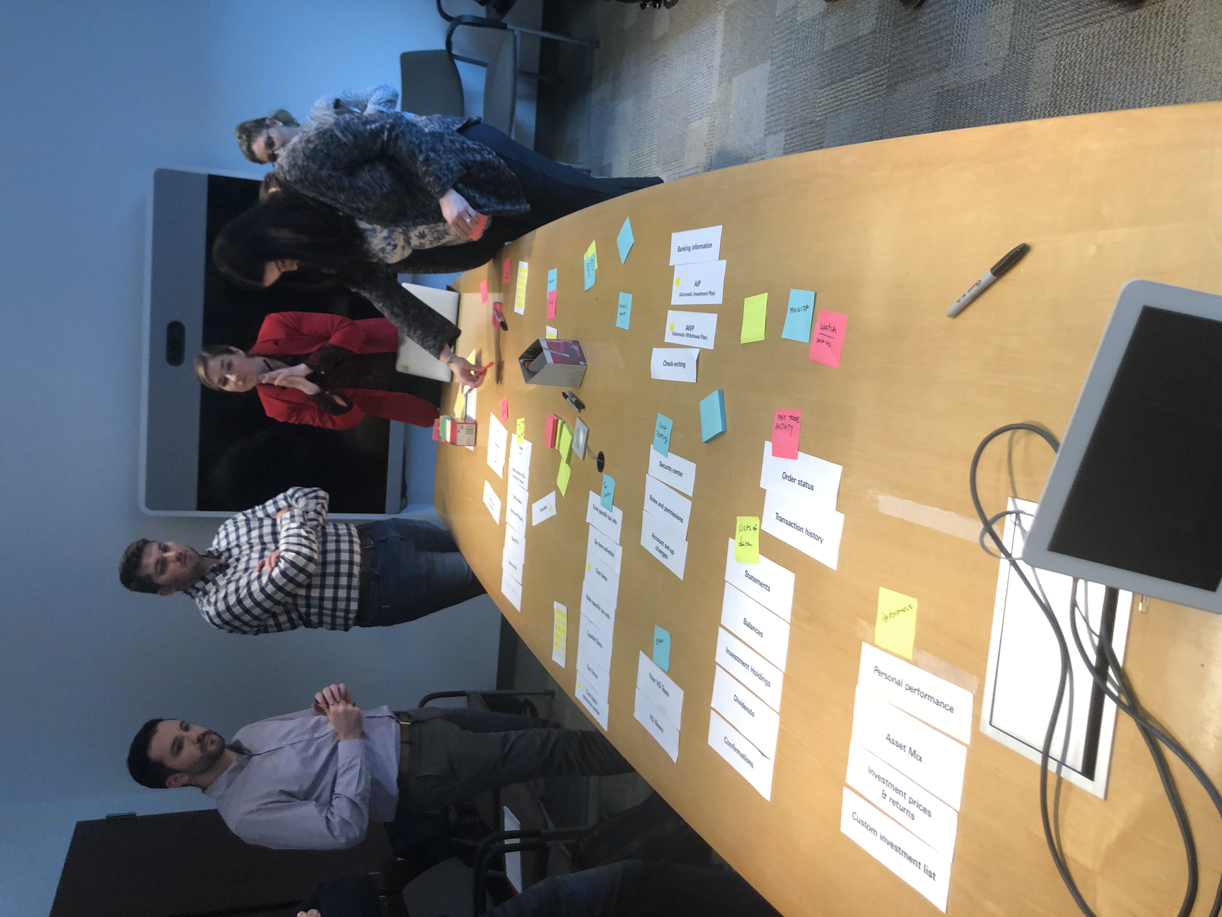
This session was 1 hour in length, the participants were guided through three activities.
1) sorting
2) labeling
3) grouping
I continue to find group sorts like this helpful because they foster deep conversations around taxonomy, strategy, and can add context to outliers.
This session was 1 hour in length, the participants were guided through three activities.
1) sorting
2) labeling
3) grouping
I continue to find group sorts like this helpful because they foster deep conversations around taxonomy, strategy, and can add context to outliers.
Process photos
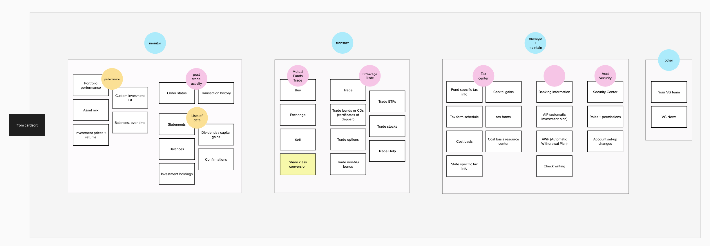
Resulting architectural organization
![]()
Navigational inspiration
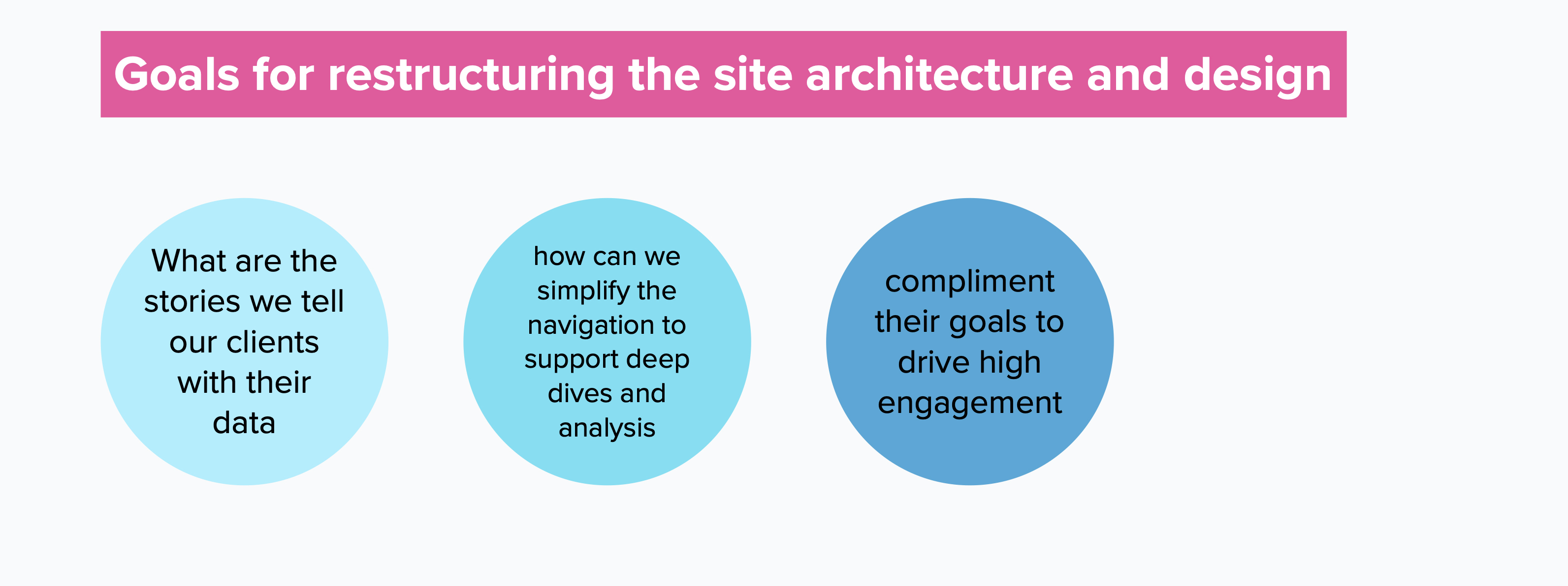
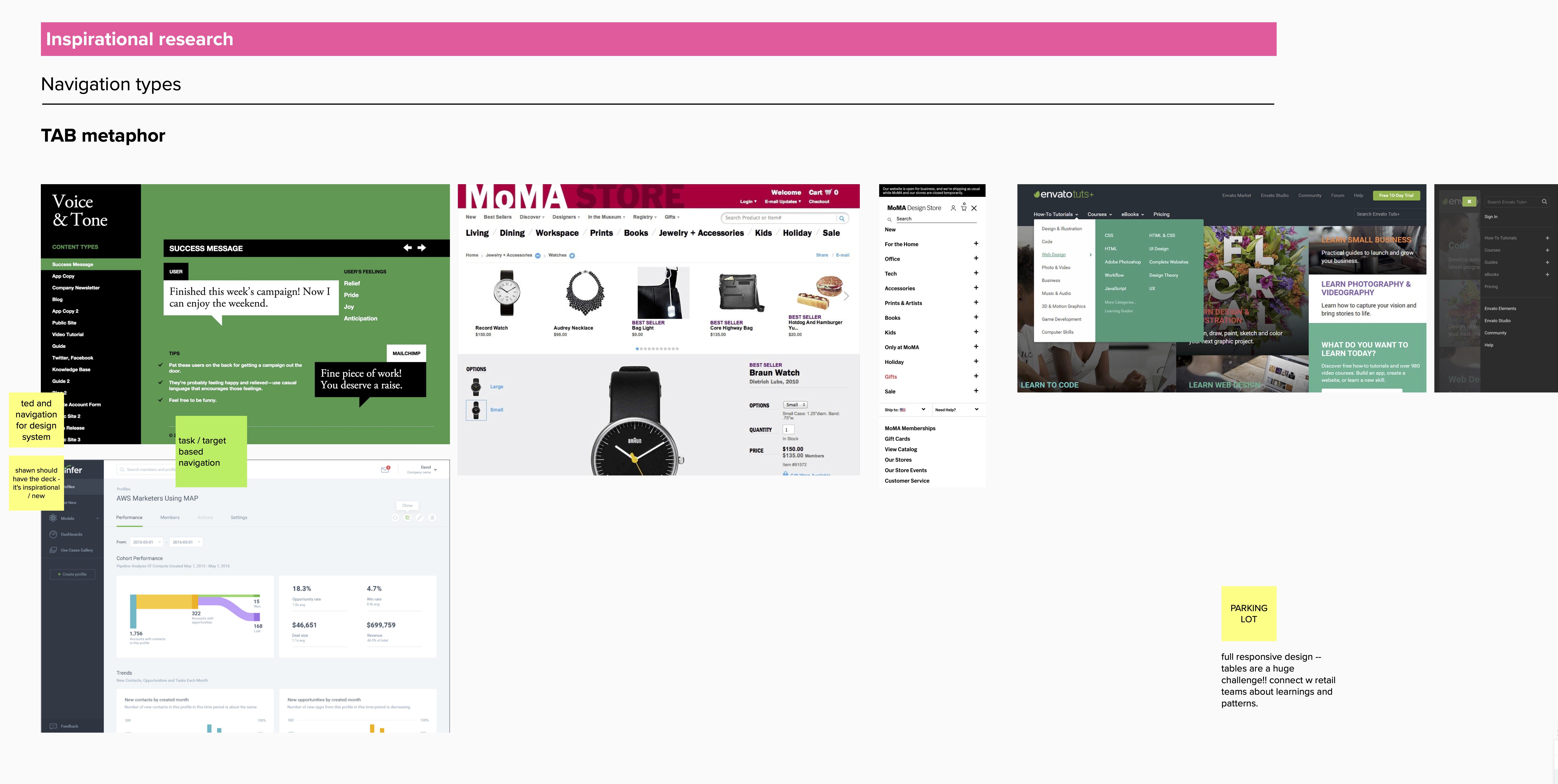
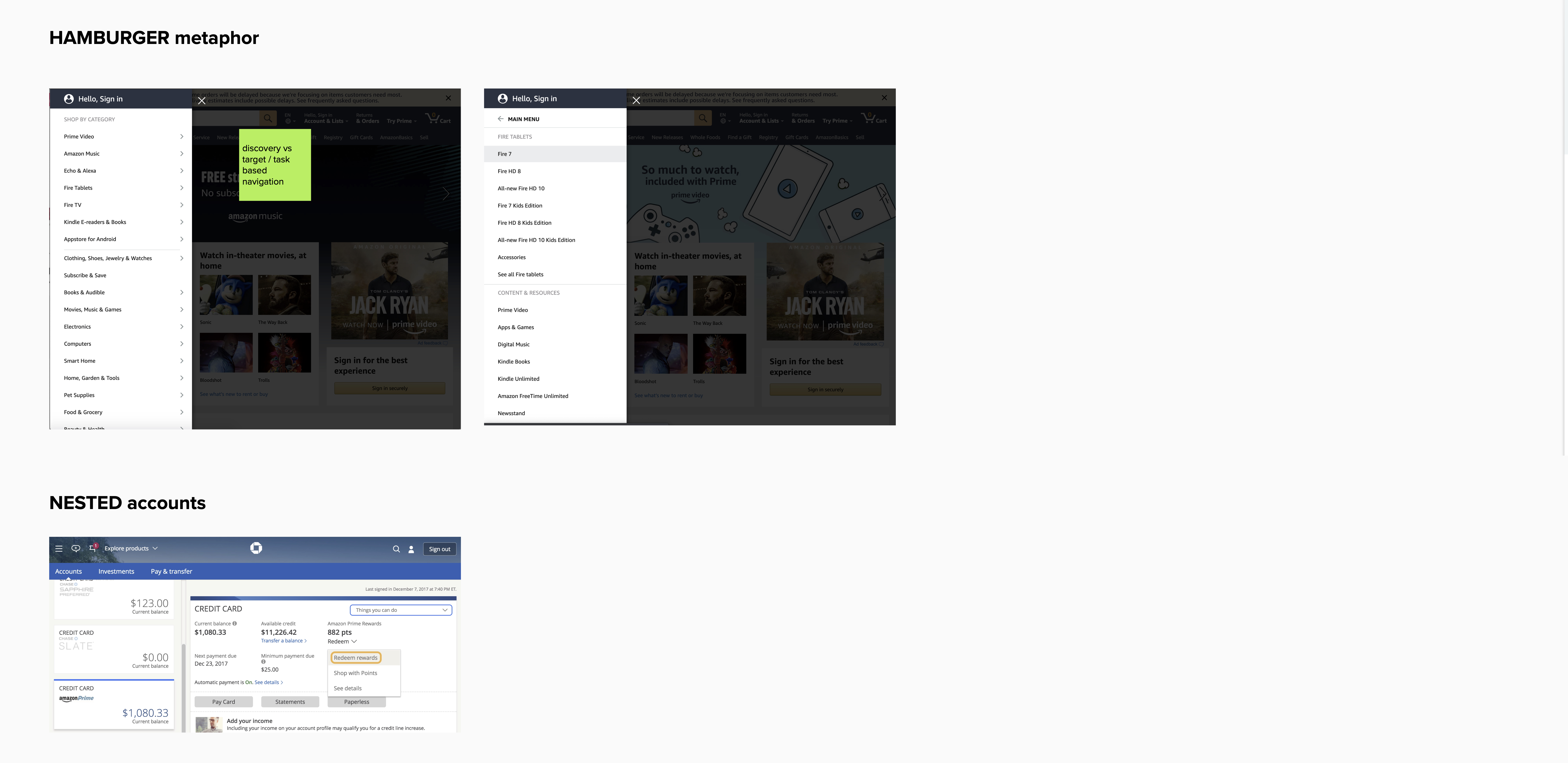
mural.co was leveraged as a remote record keeping, ideation, and exploratory digital board.
Representations of navigation systems were cataloged, inspected, and analysed.
mural.co was leveraged as a remote record keeping, ideation, and exploratory digital board.
Representations of navigation systems were cataloged, inspected, and analysed.
Architectural modelling
![screen capture from mural]()
Hilfstext
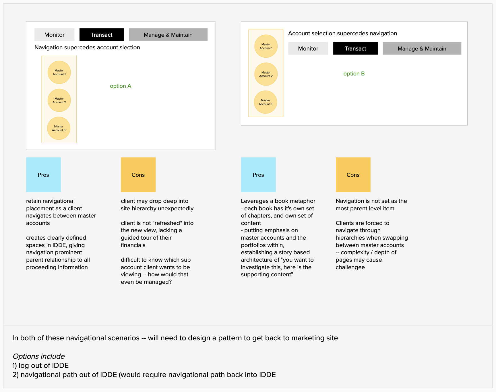
These are two structures I proposed from the cardsort learnings and inspiration analysis. Basic in form and delivery, but conceptually speaking they have a severe variance in the navigations mental model.
The example on the left proposes a structure where clients navigate contexually by action, and subsequently by account.
The example on the right proposes the opposite structure, where-by one navigates by account, and subsequently by action.
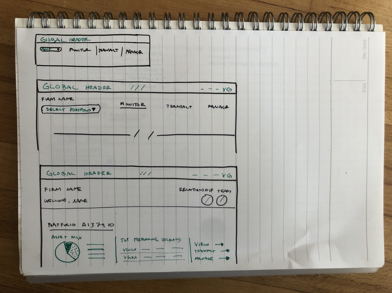
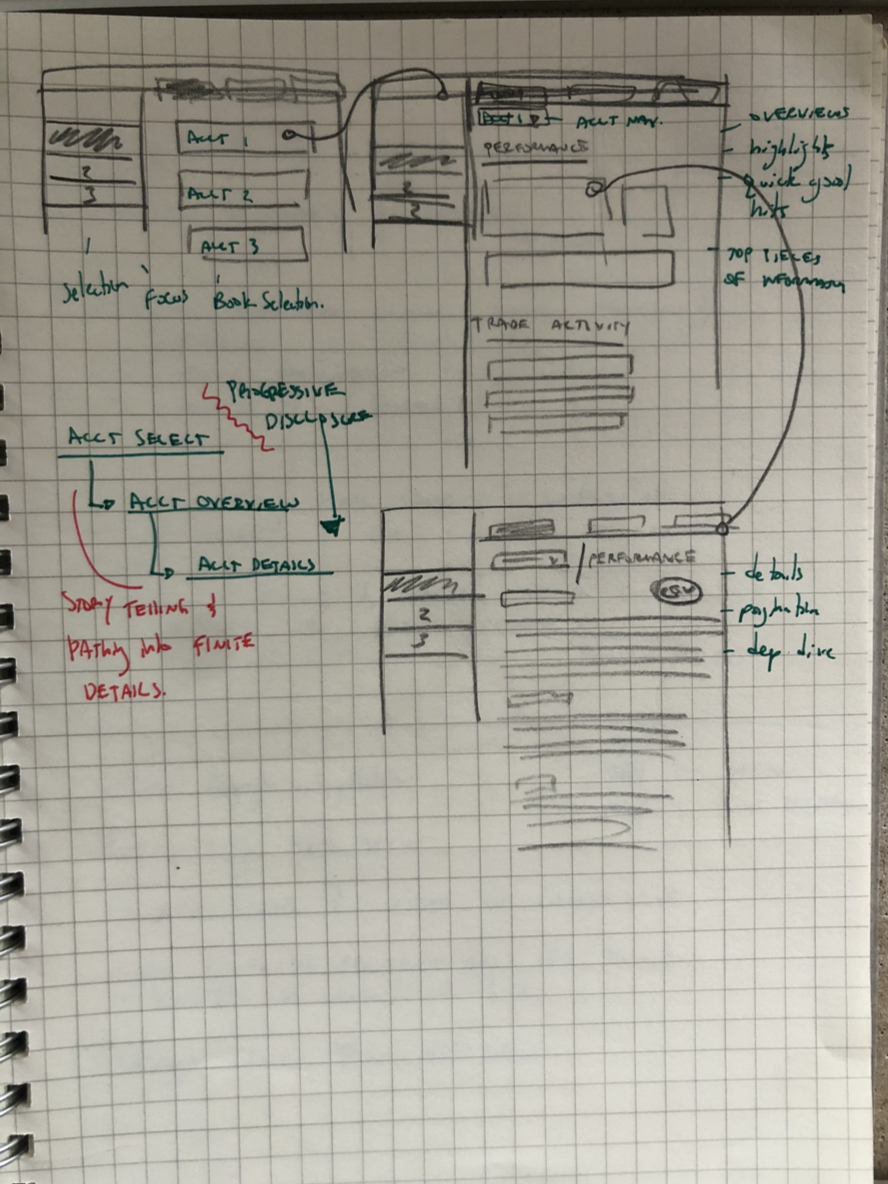
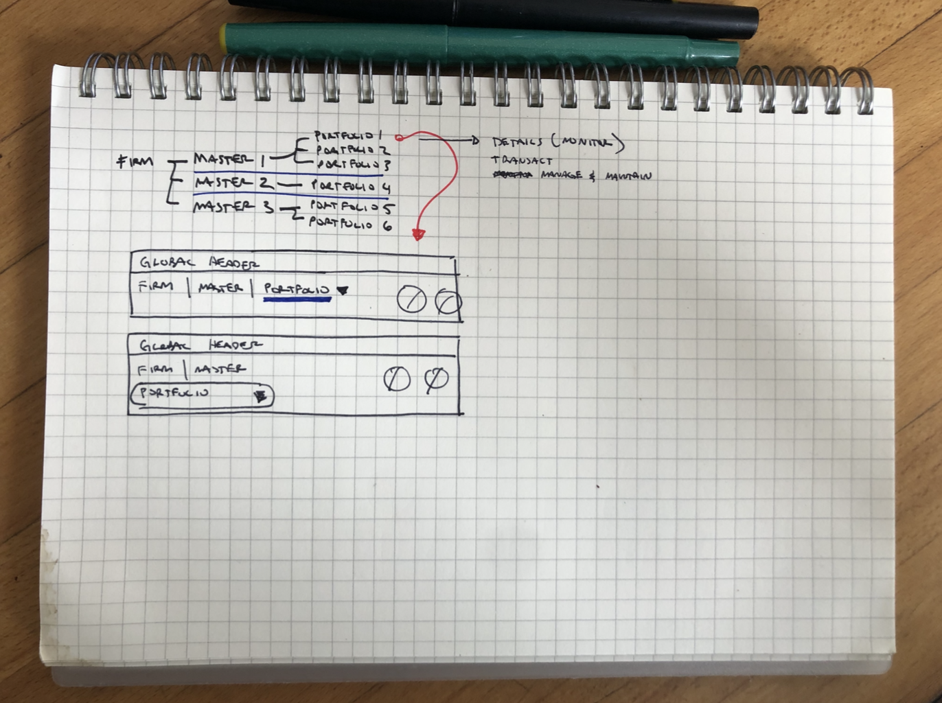
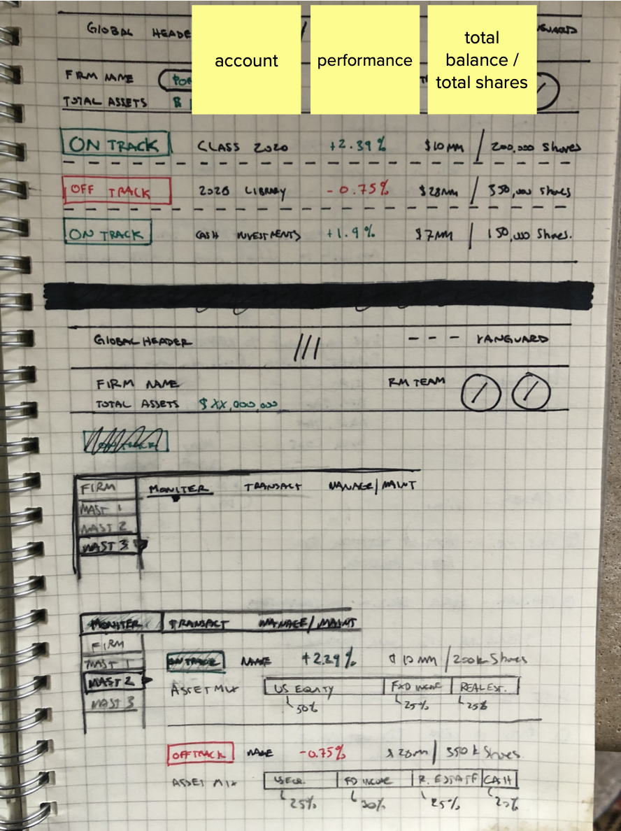
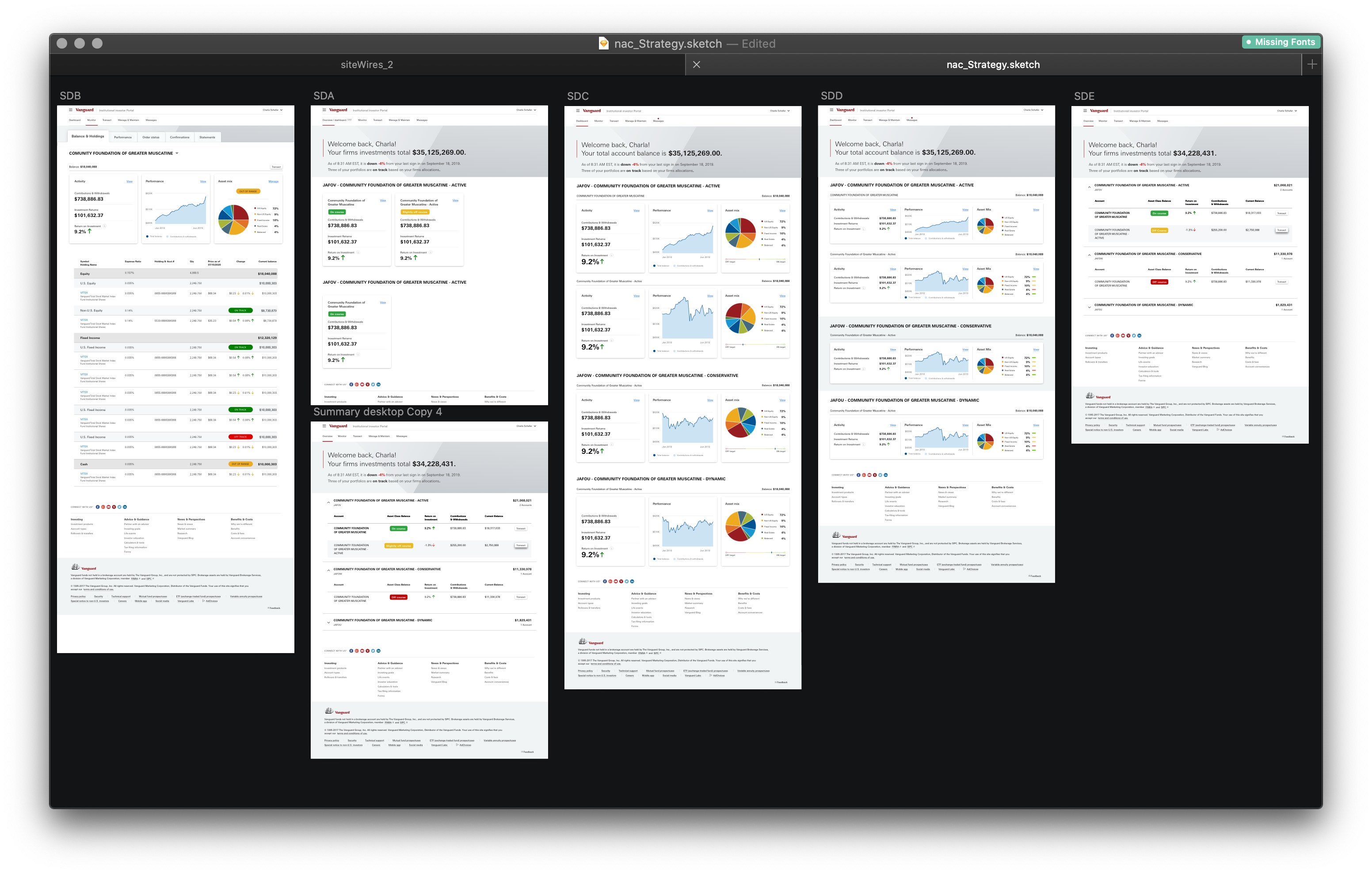
Wireframe Explorations
Displayed here are a few explorations in architecture and information display.
Displayed here are a few explorations in architecture and information display.
Moderated Client Research
Below is a 3 part remote research session I designed and facilitated with the UX team. The goal of these studies were to understand how clients prioritized different aspects of information pertaining to their accounts, and the performance of said accounts. Additionally, we focused on “what’s working now,” and “of these ideas, do you feel would benefit your goals?”
![]()
Below is a 3 part remote research session I designed and facilitated with the UX team. The goal of these studies were to understand how clients prioritized different aspects of information pertaining to their accounts, and the performance of said accounts. Additionally, we focused on “what’s working now,” and “of these ideas, do you feel would benefit your goals?”

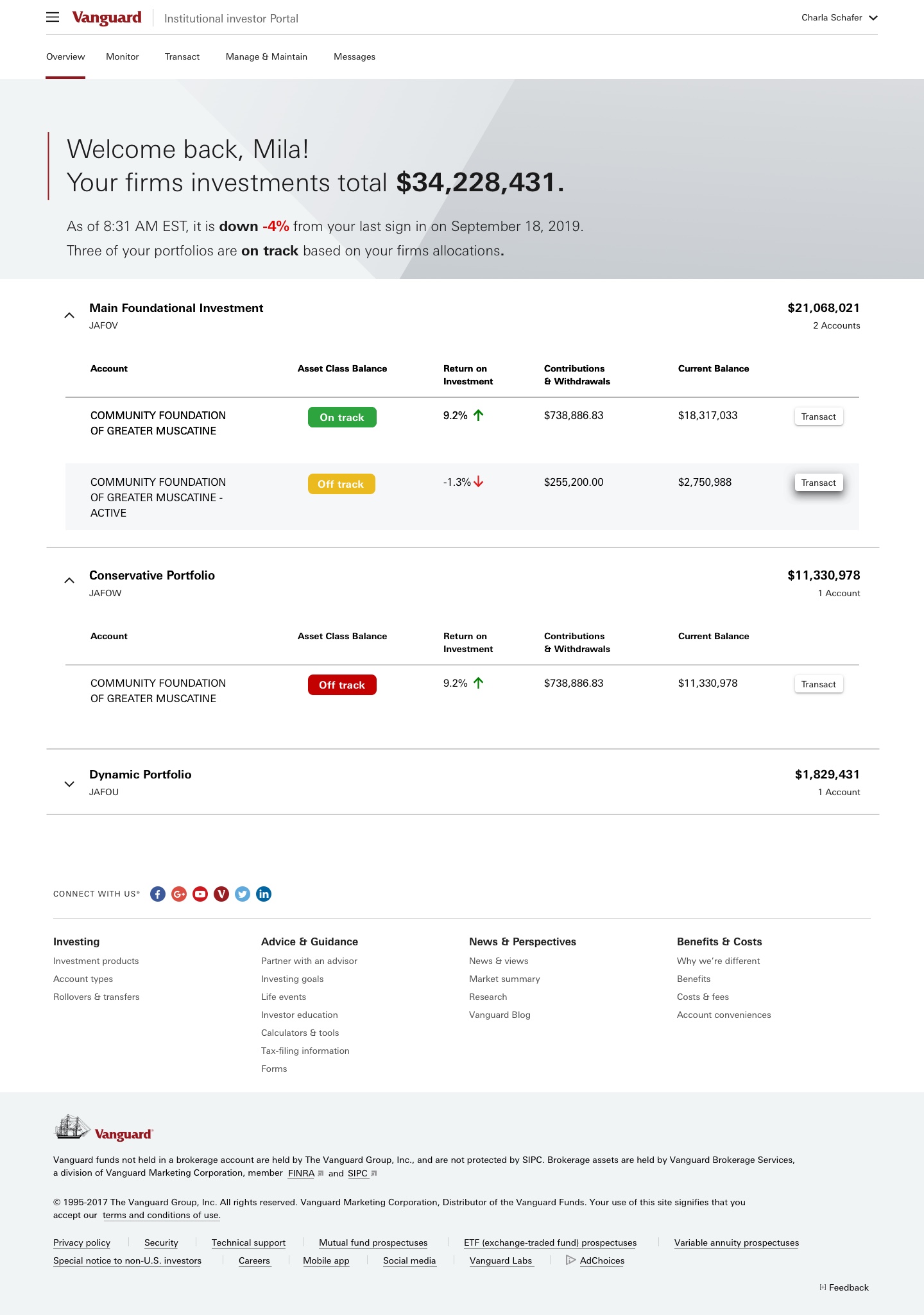
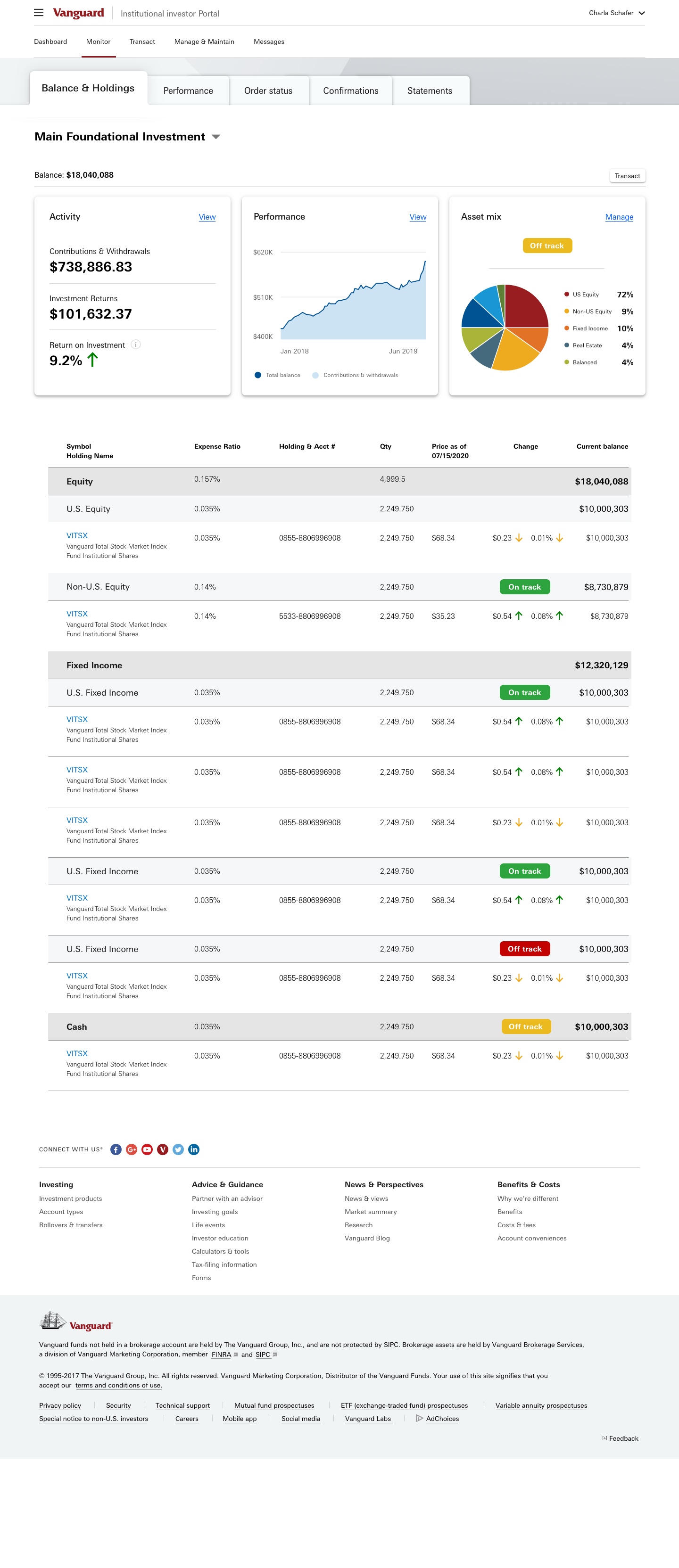
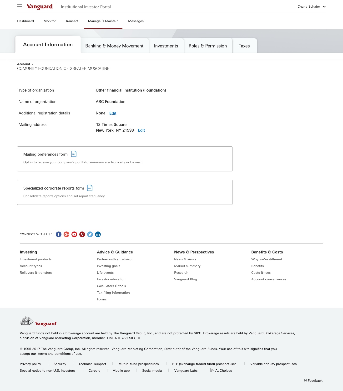
Final Designs
Interviews and remote usability sessions garnered positive feedback around the simplicity and structure of the proposed architecture / navigational structure.
Interviews and remote usability sessions garnered positive feedback around the simplicity and structure of the proposed architecture / navigational structure.
Task was retained as the prominent navigational parent, with account proceeding task.

A few process sketches

